National Bank of Greece Cultural Foundation
Crafting a timeless identity for Greece's leading cultural and publishing institution, rooted in its bond with the National Bank of Greece.
Services

The Challenge
_______
Developing a new identity for MIET was a rebranding task of unusual difficulty. The brief, as set out from the outset in the relevant call for proposals, carried two distinct demands. The first: to develop a contemporary identity that would reflect the Foundation’s values, history and mission. The second: to give visual form to MIET’s indissoluble bond with the National Bank of Greece (NBG) — without allowing that bond to overshadow MIET’s own identity and autonomy. Finding this delicate balance became the defining question behind every decision that shaped our design methodology and the final result.
The Solution
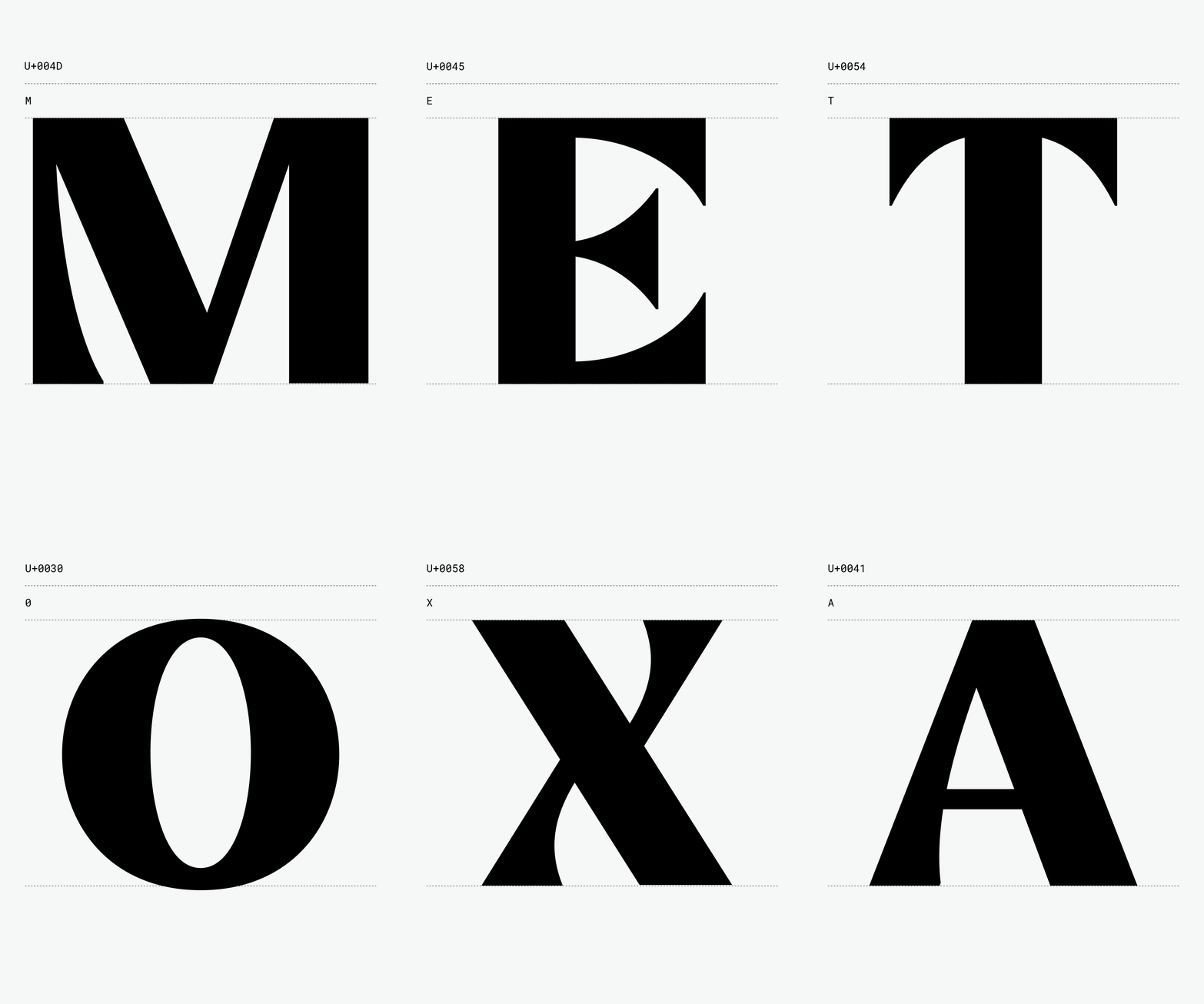
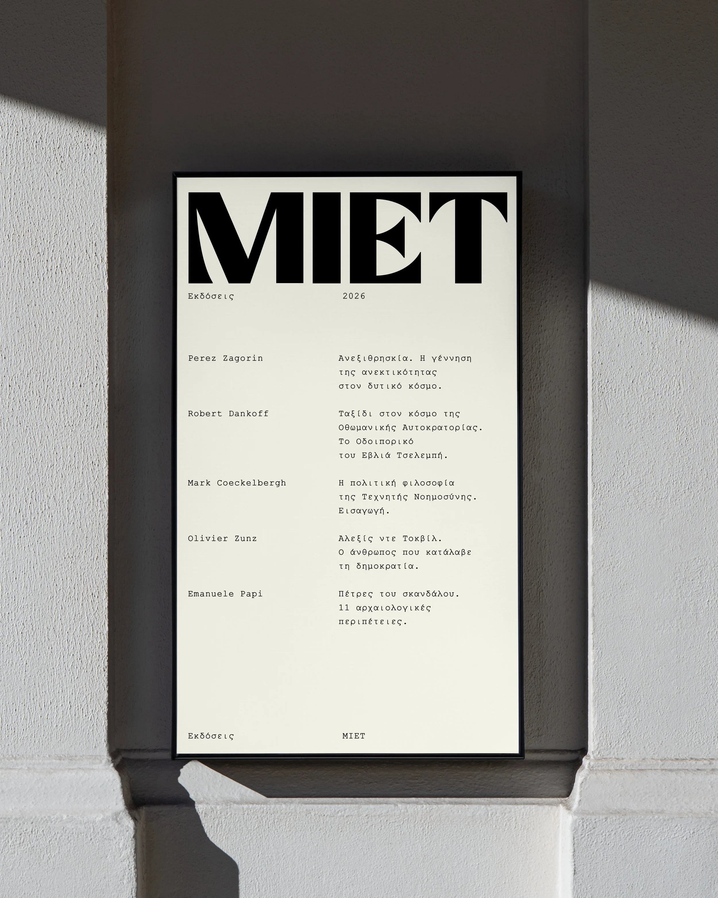
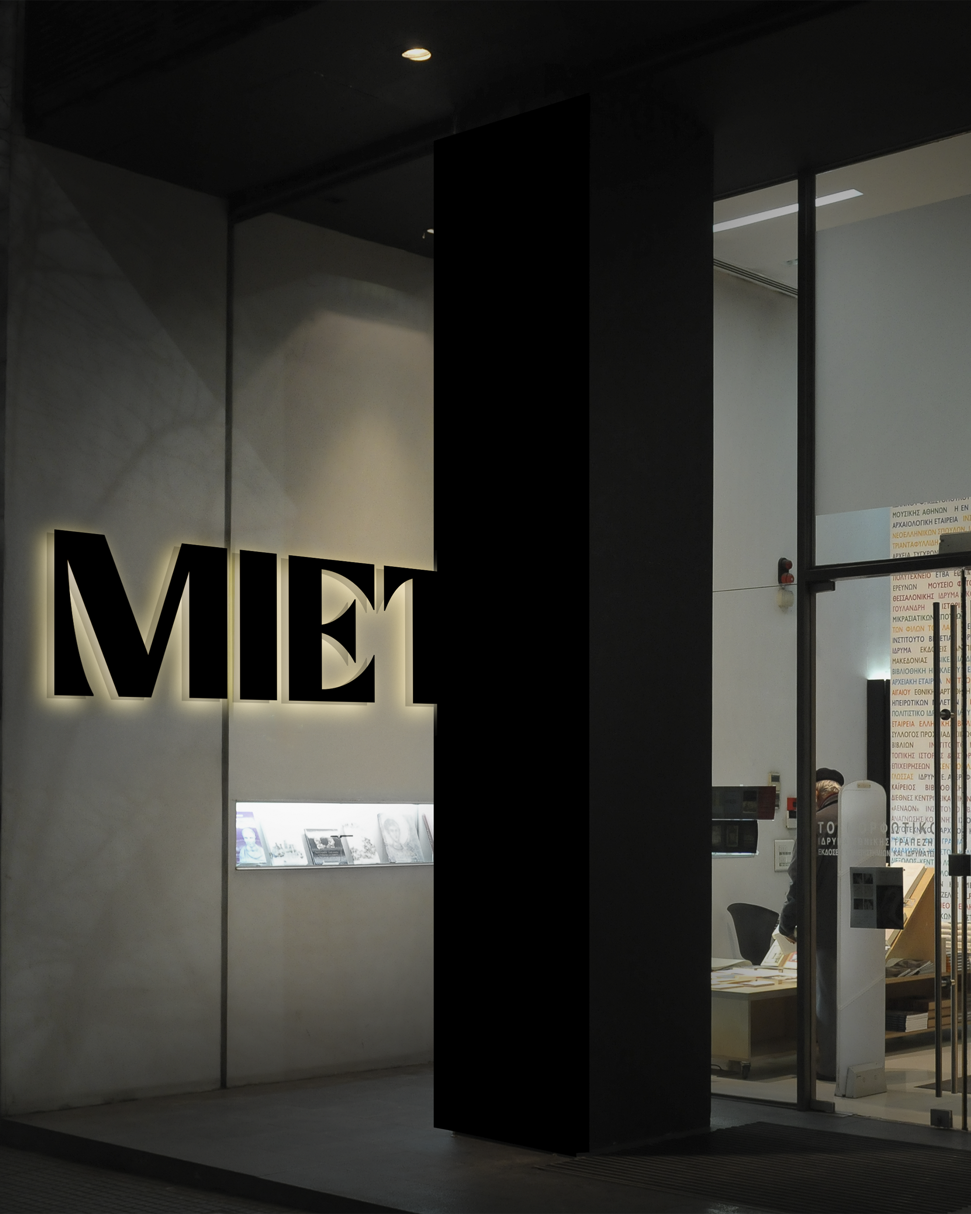
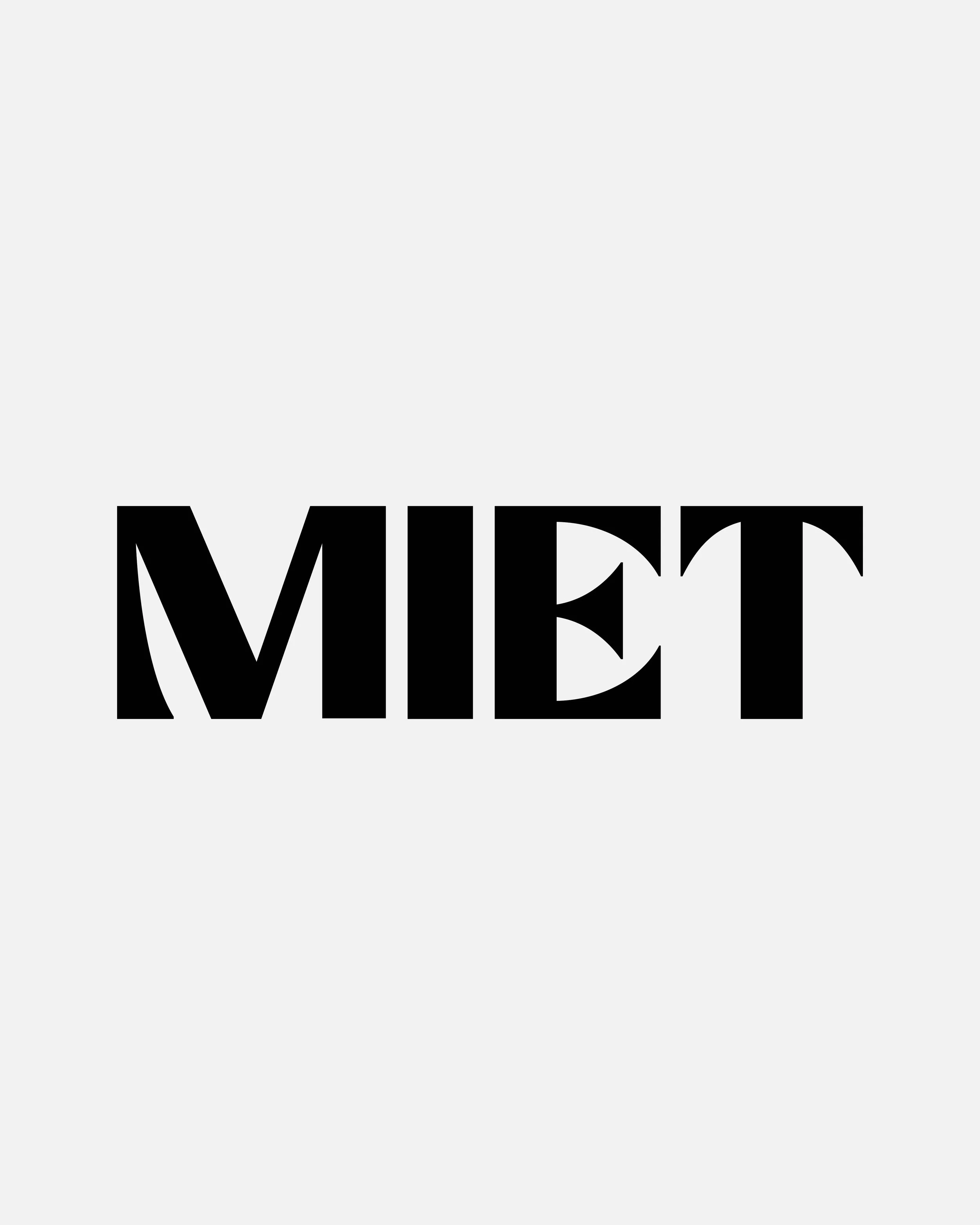
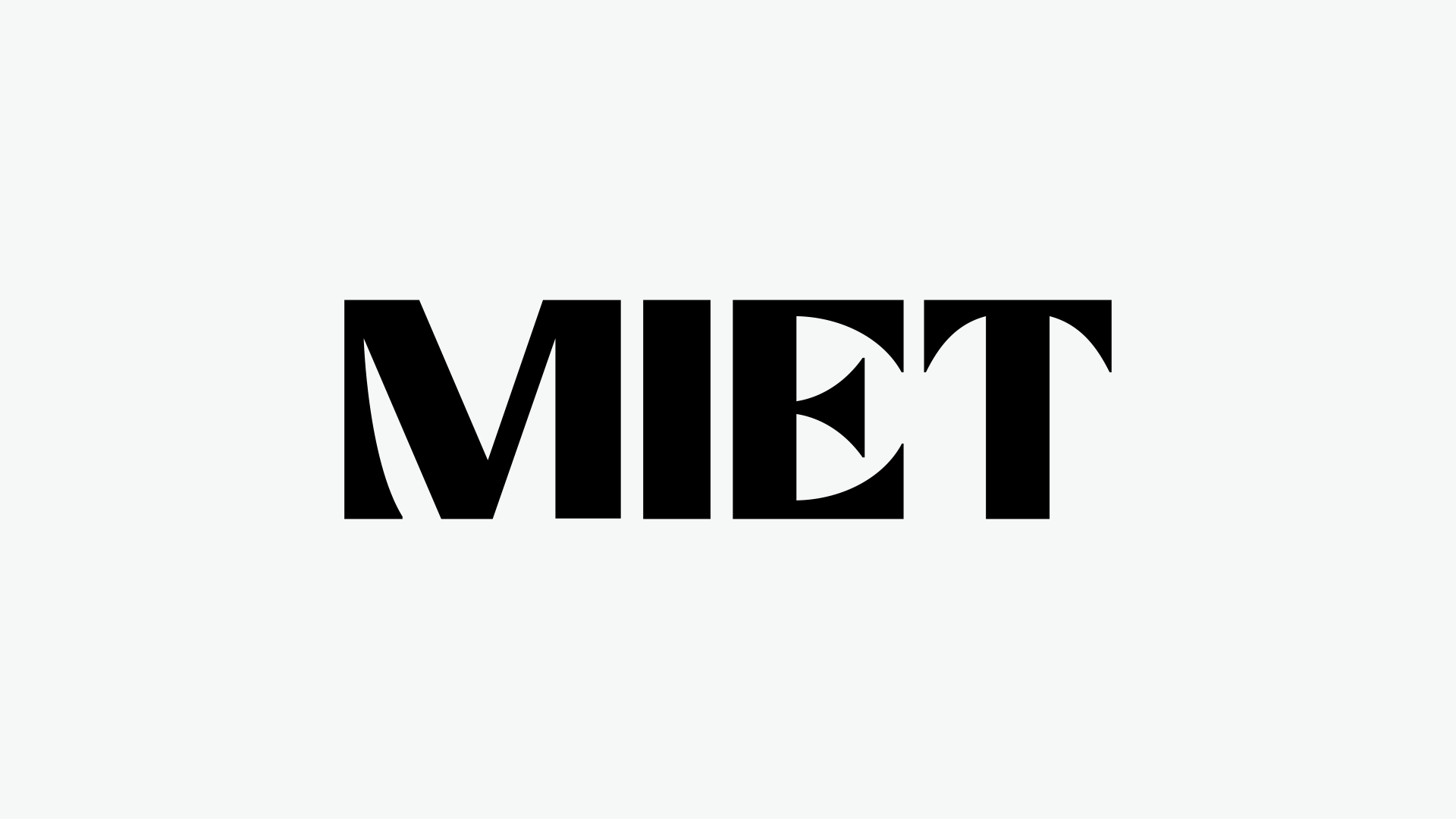
At the core of our approach sits typography. This was never simply an aesthetic decision, but a deep strategic move with multiple references and implications. For an institution like MIET — inseparably linked to publishing and academic literature — typography is the cellular element that carries the imprint of its mission and work. Starting from this position, we focused on developing an original typeface, so that the new wordmark would not be merely a beautiful piece of lettering, but a powerful statement of identity: the connective thread binding together the Foundation’s many different departments and activities.
At the heart of the design methodology lies a visual element every Greek citizen recognizes: the National Bank’s characteristic ellipse, drawn from its historic building on Kotzia Square — a motif that remains part of the Bank’s identity to this day. Rather than using the ellipse as a standalone shape, or in some graphic variation of it, we made the unconventional choice to use it to define the negative space within the letterforms of the word MIET itself. The result is a new and distinctive typographic form: the ellipse becomes the quiet but powerful link between MIET and the Bank — not announced, but organic — carrying additional reference and meaning within the final letterforms.